Dusty Rose & Sage Wedding Palette (Romantic, Earthy + Budget-Friendly Ideas That Actually Work)
Soft dusty rose, sage green, and warm blush tones come together in this earthy wedding palette with simple, romantic ideas for styling, decor, and budget-friendly inspiration.
WEDDING CORNER
3/30/20264 min read
This palette is a little extra special to me because it’s actually what I used for my own wedding in 2024.
At the time, I didn’t really overthink it. I knew I wanted something that felt warm, earthy, and not overly traditional. Looking back now, I realize I was basically building this soft, muted, romantic palette without even having a name for it.
And honestly? I still love it.
There’s something about it that feels really grounded and calm, but still romantic in a very effortless way. If I were doing it all over again (or helping a friend plan theirs), I would 100% land in this same color story.
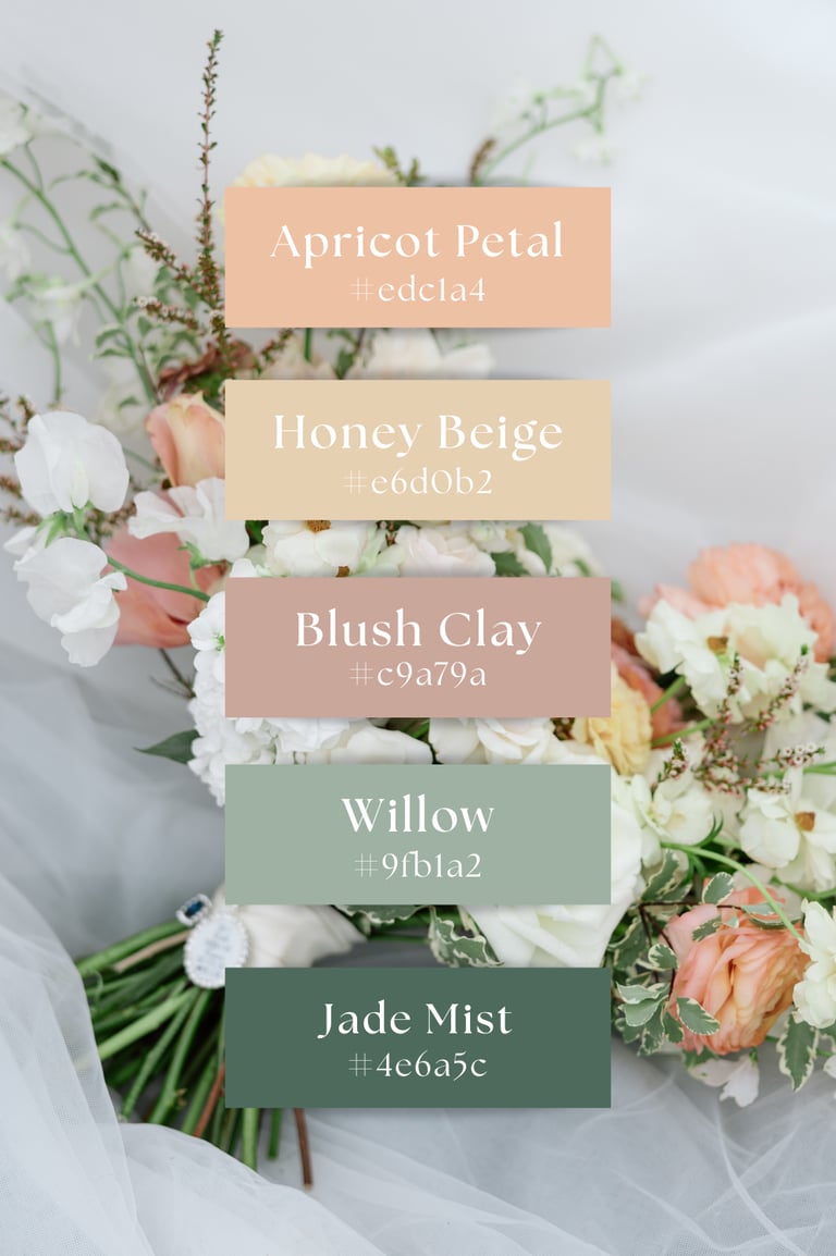
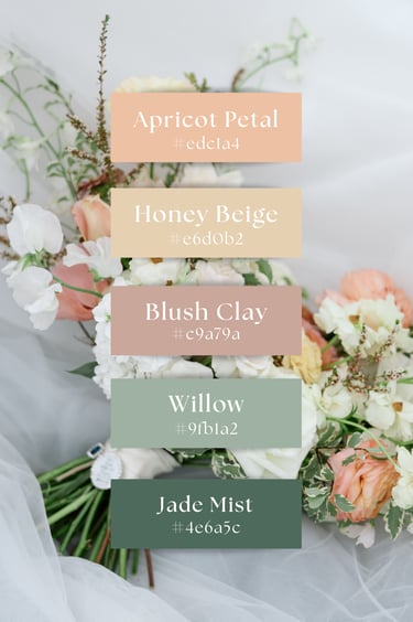
The Palette I Used
Here are the exact tones that brought everything together:
Apricot Peach — #edc1a4
Honey Beige — #e6d0b2
Blush Clay — #c9a79a
Willow Sage Green — #9fb1a2
Deep eucalyptus green — #4e6a5c
Together, they create this really soft balance between warm and cool tones. Nothing feels too bold, but everything still has its place.
It’s kind of like a desert garden meeting a soft, romantic evening light.
The Overall Feel
If I had to describe how this palette feels, not just how it looks, I’d say:
warm but not heavy
romantic without being overly pink or girly
earthy in a really soft, natural way
simple, but still intentional
It worked beautifully for a wedding setting because it didn’t compete with anything, just quietly supported everything happening around it.
How It Showed Up in Real Life
This is where it got really fun for me, because seeing it all come together in person was so different from just looking at colors on a screen.
Bridesmaids & Attire
For the bridesmaids, I went with sage green chiffon as that was one of our main (and my favorite hehe) colors.
When it came to the style, each of my girlies picked whatever they felt most themselves in. That was something very important to me from the start. wanted the girls who have supported me through so many seasons of life to feel just as beautiful and comfortable as I did that day.
And honestly, it ended up being one of my favorite decisions. Being able to see the styles everyone choose and knowing the day of that everyone felt beautiful and comfortable was priceless.
Even though the dresses were all slightly different, the color and fabric kept everything cohesive. It didn’t feel too “perfect” or overly matched, which made it feel more natural and relaxed. And you could just tell everyone felt confident, which mattered way more to me than everything looking identical.
Looking back, I would do it the exact same way again. The fabric felt soft and elevated without being too shiny or formal, and the matte texture made everything look a little more grounded and natural. It also photographed really well, especially against the warmer tones in the rest of the palette.
Ceremony + Tables
I kept the tables pretty simple, but this is honestly where the palette really came to life.
We used:
beige table runners as the base
a mix of light sage and blush candles
small florals that tied everything together
The candles added just enough color without overwhelming the table, and mixing the sage and blush tones kept it from feeling too one-note.
It was one of those setups that didn’t feel overly styled, but still looked really intentional once everything was together.
Florals
Something I am extremely grateful for is the fact that our venue has so much natural beauty that we didn't have to decorate much with florals.
We mostly used:
white flowers as the base
touches of soft blush
hints of a buttery, deeper yellow
and lots of greenery for texture
The yellow was subtle but added a little warmth that made everything feel more alive, especially mixed with the softer tones.
Looking back, I’m really glad I didn’t overdo it here. It felt balanced and natural without taking over the space.
What I’d Do Again (and What I’d Keep Budget-Friendly)
One thing I learned pretty quickly is that this palette doesn’t need a lot of “stuff” to feel complete.
If I were recreating it again or helping someone plan it now, I’d focus on:
greenery over large floral installations
layered neutral textures instead of bold decor
mixing tones instead of trying to match everything perfectly
Some of the easiest wins:
runners instead of full linens
garlands instead of bulky centerpieces
simple printed signage instead of custom builds
It’s one of those palettes that actually gets better when you don’t overdo it.
Shop This Wedding Look
If you’re trying to recreate this same feel, I’d look for pieces like:
sage, clay, or blush-toned bridesmaid dresses
eucalyptus garlands for tables or arches
warm ivory table runners
minimal gold or neutral accents (we found wildflower gold candlestick holders at dollar tree!!)
simple printable signage (menus, seating charts, etc.)
This palette also works really well for mixing budget and slightly higher-end pieces because everything naturally blends together.
A Few Things I Noticed Looking Back
Now that I’ve had time to sit with it (and see the photos a million times), a few things really stand out:
it photographs best in natural light
texture matters more than exact color matching
slightly imperfect styling actually makes it feel more expensive
the softness of the palette hides a lot of “budget” details in a good way
Final Thoughts
This dusty clay and sage palette will always feel a little sentimental to me because it was such a big part of my wedding day.
But beyond that, it’s just one of those combinations that works. It’s soft, warm, and really easy to build around without feeling overwhelming.
If I had to plan a wedding again—or help someone else plan one from scratch, this would still be at the top of my list. It’s simple in the best way.
If you end up using this palette in any way (wedding, party, even just at home) I’d genuinely love to see it. I feel like it’s one of those looks that always turns out a little different depending on the person, which makes it even better.