How to Choose the Colors for Your Wedding (Without Overthinking It)
Choosing your wedding colors doesn’t have to feel overwhelming—here’s how to create a palette that feels intentional, timeless, and completely you.
WEDDING CORNER
2/26/20263 min read


If you’ve ever fallen down a Pinterest rabbit hole of “dusty blue vs. slate vs. french blue”… hi, you’re not alone. Color is one of the first wedding decisions couples stress about, and honestly, it doesn’t have to be.
After creating hundreds of color palettes (and seeing over 520,000 Pinterest views from them alone), I’ve learned this: The best wedding color palettes feel intentional, personal, and effortless.
Let’s walk through how to choose yours, step by step, without being overwhelmed.
Start With the Feeling, Not the Colors
Before you even think about specific shades, ask yourself this:
How do you want your wedding to feel?
Romantic and soft?
Bold and modern?
Earthy and organic?
Timeless and elegant?
Your vibe matters more than any trending color. Once you know the feeling, the colors naturally fall into place.
✨ Tip: If your Pinterest board feels chaotic, that’s okay. Look for patterns—are you pinning airy neutrals, moody florals, or bright pops of color? That’s your clue.
Let Your Venue Do Some of the Work
Your venue already has colors—walls, floors, greenery, lighting—and those should be part of your palette.
A few examples:
A garden or outdoor venue pairs beautifully with soft neutrals, greens, and organic tones.
A modern white space can handle bold contrast or minimalist palettes.
Historic venues shine with rich, classic hues.
Instead of fighting the space, let it guide you. Your palette should belong there.
Choose One Anchor Color You Love
This is your starting point—the color that makes you light up.
It might be:
A shade you already love wearing
A color from your proposal, engagement photos, or season
A hue you keep saving again and again
Once you have that anchor, build around it with:
1–2 supporting colors
1 neutral (this is key for balance)
That’s it. You don’t need seven colors to make it beautiful.
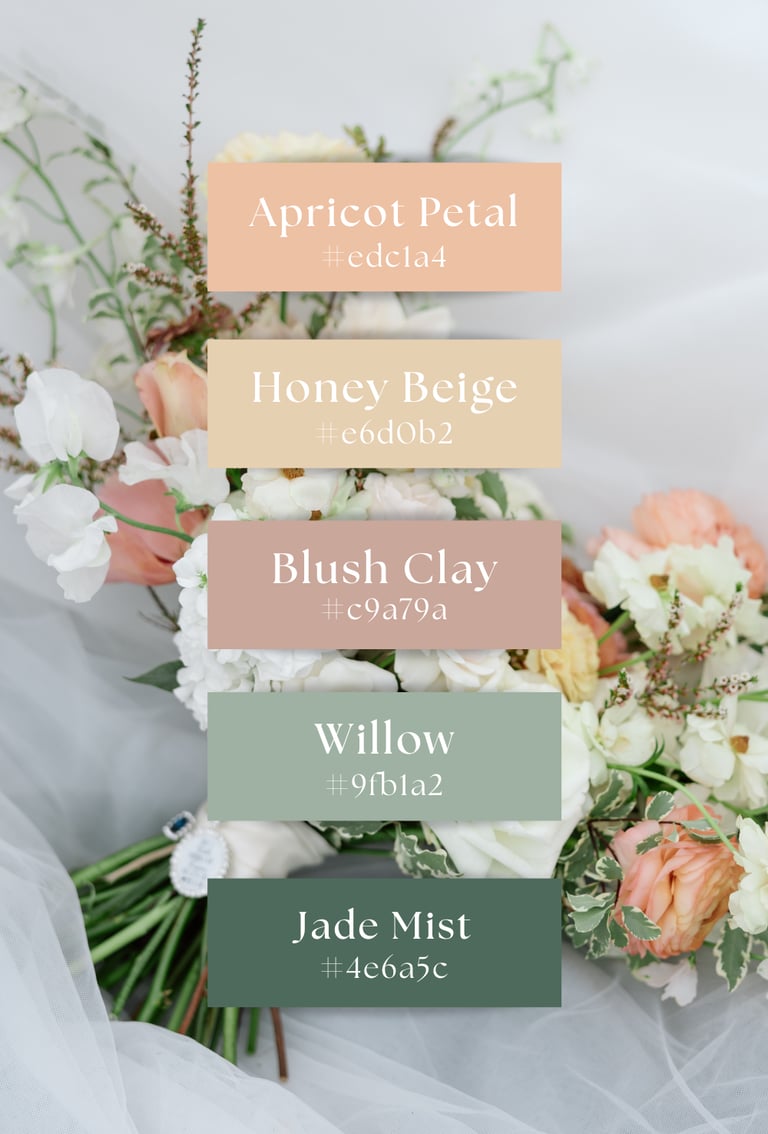
Neutrals Are the Secret Sauce
Neutrals are what make a palette feel elevated instead of overwhelming.
Think:
Warm ivory instead of stark white
Soft taupe instead of flat beige
Muted gray instead of harsh black
Neutrals give your eye a place to rest—and they photograph so well.
If you’re ever unsure, add a neutral and suddenly everything makes sense.
Consider the Season (But Don’t Let It Boss You Around)
Yes, seasons matter—but they’re a guideline, not a rule.
Spring: airy pastels, fresh greens
Summer: brighter hues, coastal tones
Fall: warm, earthy colors
Winter: deep, rich, or icy neutrals
If you love a fall color palette for a spring wedding? Do it. Just soften the tones and adjust the textures. Color is flexible like that.
Test Your Palette Before You Commit
Before locking anything in, try seeing your colors together:
Create a simple digital palette
Drop the colors into a Canva mockup
Compare them side by side in natural light
If it feels calm and cohesive, you’re on the right track. If something feels “off,” trust that instinct—it’s usually right.
When we were choosing our own wedding colors for our end-of-September outdoor wedding, I remember feeling that same pressure to “get it right.”
I didn’t want anything too summery, but I also wasn’t ready for deep, moody fall tones. We ended up choosing warm, sun-kissed neutrals paired with soft, earthy greens, and it was exactly what the season called for.
The colors felt natural against the changing landscape, romantic without trying too hard, and timeless in a way that still feels like us when I look back at photos. It reminded me that the best palettes aren’t the trendiest ones, they’re the ones that feel aligned with your story and your setting.
Remember: Your Palette Sets the Mood, Not the Rules
Your wedding colors don’t need to appear everywhere. They’re there to guide the design—not control it.
When your palette is intentional:
Your florals feel cohesive
Your stationery makes sense
Your photos look timeless
And most importantly—it feels like you.
If you’re feeling stuck, overwhelmed, or second-guessing every shade, that’s usually a sign you just need a clearer starting point. Color should feel fun, not stressful.
Trust your eye. You’re better at this than you think ♡